
In an increasingly data-driven world, the ability to analyze and visualize complex datasets is a skill of great value. In this article, I present my Power BI project, which focuses on analyzing sales performance, returns, and customer behavior. This project not only demonstrates my proficiency in Power BI but also showcases my data analysis and visualization skills.
Project Overview
Power BI Dashboard
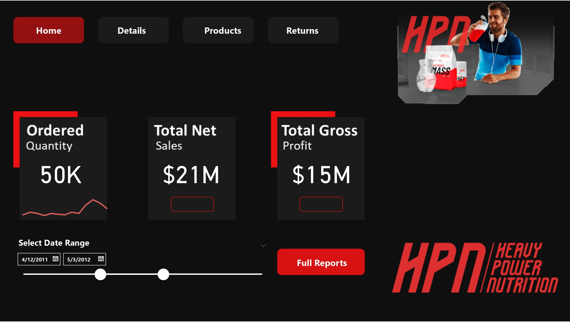
Main Page
The main page serves as the central hub of the dashboard. It offers a user-friendly interface that allows users to access different sections of the project. Key features include:
Buttons: These buttons lead to different sections of the dashboard: “Transaction Details” and “Returns.” Metrics: This section presents important metrics, including ordered quantity, total net sales, and total gross profit. Slider: Users can select a date range to filter the data dynamically.
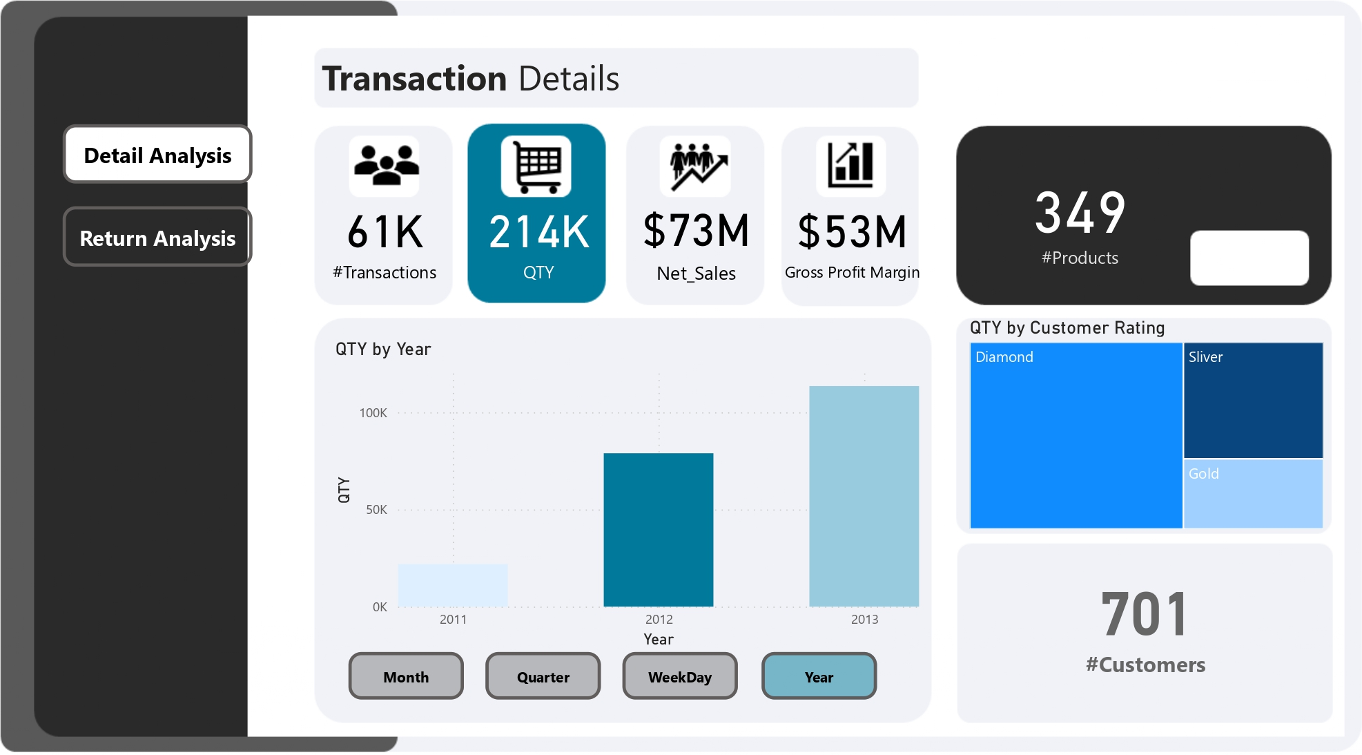
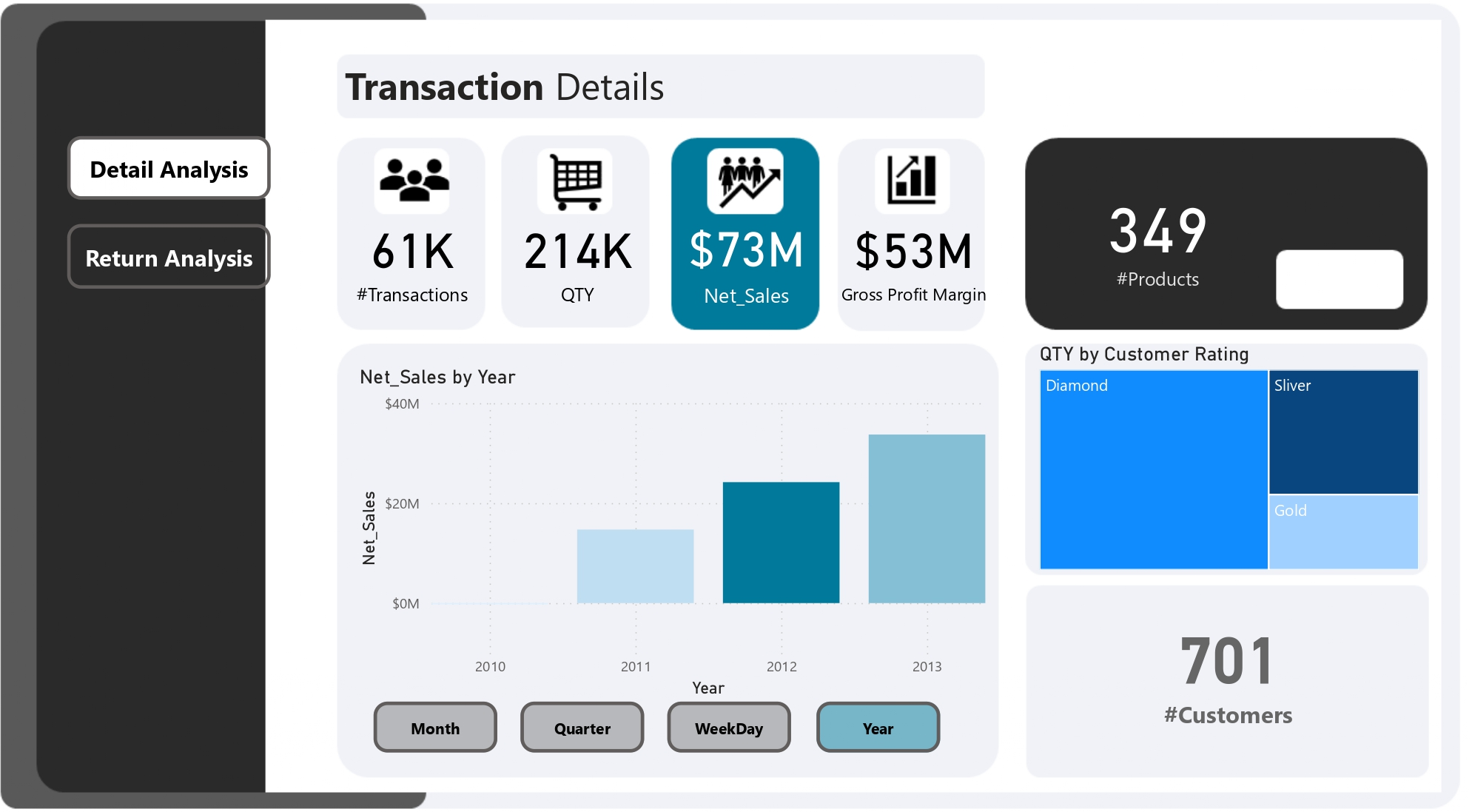
Transaction Page
The transaction page delves into the details of sales performance. Users can explore the following features:
Metrics: These metrics provide insights into various aspects of transactions, including total transactions, quantity, net sales, gross profit margin, and the number of products. Graphs: Users can visualize data through graphs, such as transactions by customer ranking and transactions by different time intervals (month, quarter, year, or day).

Qty Ordered Page
This page focuses on the quantity of products ordered. It includes:
Metrics: Metrics display important information related to quantity ordered, net sales, gross profit margin, and the number of products. Graphs: Users can explore data through graphs, including quantity by customer ranking and quantity by different time intervals.
Net Sales Page
The net sales page helps users understand revenue generated after considering discounts and refunds. Features include:
Metrics: Metrics show net sales, quantity, gross profit margin, and the number of products. Graphs: Users can visualize data through graphs like net sales by customer ranking and net sales by different time intervals.
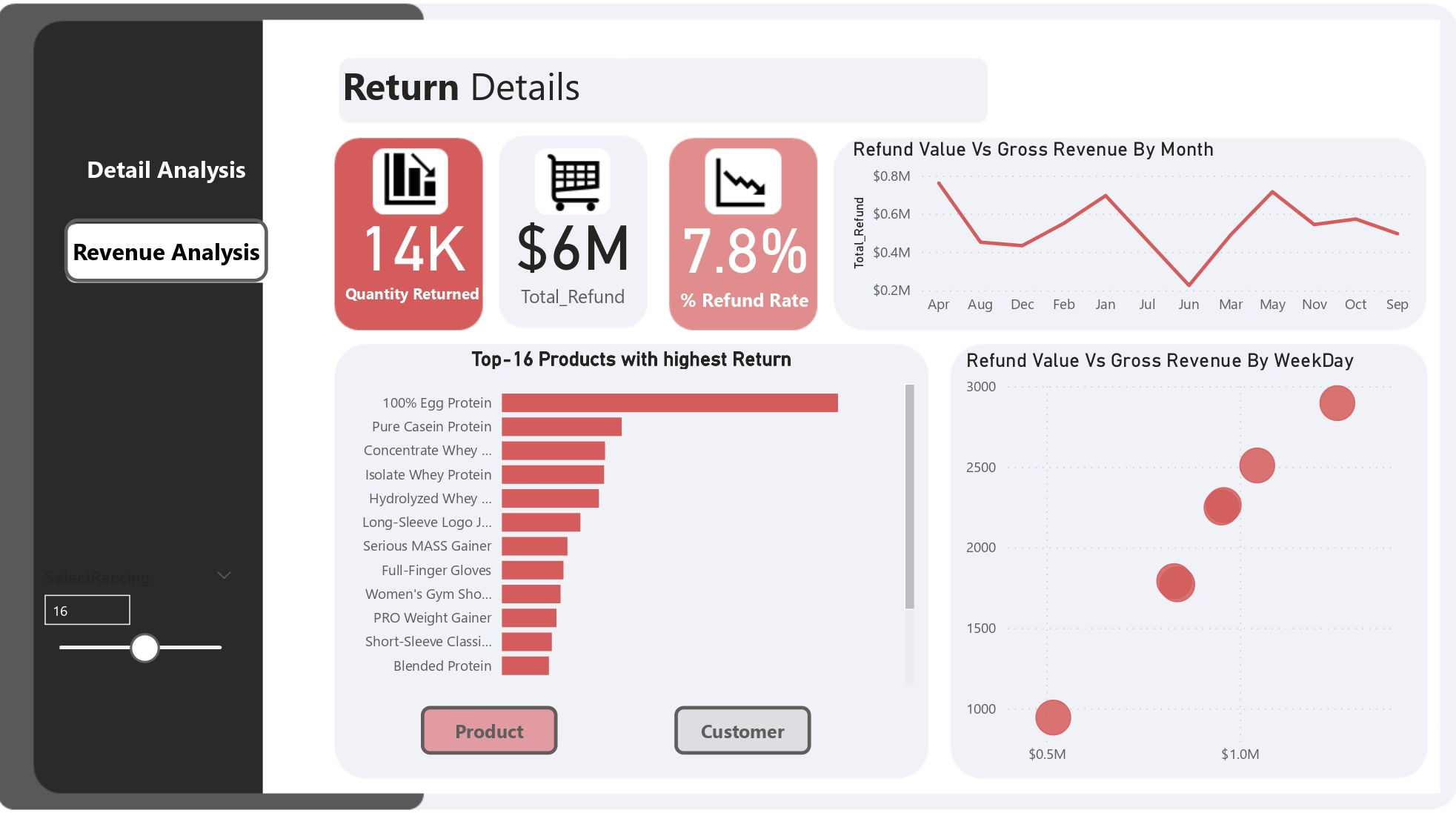
Returns Page
The returns page focuses on analyzing product returns. Key features include:
Metrics: Metrics display information related to the quantity returned, total refund, and the refund rate. Graphs: Users can explore data through graphs showing returns by month, refund vs. gross revenue by day, and identifying total products with the highest return rates.
Data Sources
I used a variety of data sources for this project, including:
Dim_Customers and Dim_Products: These tables provided information about customers and products, forming the basis for our analysis. FactTable_Transactions: Containing data related to product transactions, including order quantities and prices. FactTable_Returns: Providing information about product returns, including quantities and return values. fact_product_cost
Key Metrics and Measures
I defined several key measures to analyze the data effectively:
#Customers: A simple count of unique customers in the dataset.
#Customers = COUNTROWS(Dim_Customers)
#Products: The count of distinct products, helping us understand the product portfolio.
#Products = DISTINCTCOUNT(Dim_Products[ProductKey])
% Refund Rate: Calculated as the ratio of total refunds to gross revenue, providing insights into the impact of refunds on sales.
% Refund Rate = DIVIDE([Total_Refund] , [Gross_Revenue] , 0)
COGS (Cost of Goods Sold): Determined by multiplying the product cost by the order quantity, representing the cost associated with sales.
COGS = SUMX(FactTable_Transactions, FactTable_Transactions[Product Cost] * FactTable_Transactions[OrderQuantity])
Gross Profit Margin: Calculated as net sales minus COGS, providing a measure of profit.
Gross Profit Margin = [Net_Sales] - [COGS]
Gross Revenue: Calculated as the sum of order quantities multiplied by unit prices, indicating total revenue generated.
Gross_Revenue = SUMX(FactTable_Transactions, FactTable_Transactions[OrderQuantity] * FactTable_Transactions[UnitPrice])
Net Sales: Gross revenue minus total discounts and total refunds, offering insights into actual sales.
Net_Sales = [Gross_Revenue] - [Total_Discount] - [Total_Refund]
QTY (Quantity Ordered): The sum of order quantities, showing the total items ordered.
QTY = SUM(FactTable_Transactions[OrderQuantity])
Quantity Returned: The sum of return quantities, helping analyze the extent of returns.
Quantity Returned = SUM(FactTable_Returns[ReturnQuantity])
Ranking By Customer: A ranking measure to identify top customers with the highest returns based on user selection.
Ranking By Customer =
VAR Rank_Customer = RANKX(ALL(Dim_Customers[Customer]), [Quantity Returned],, DESC)
VAR Result = IF(Rank_Customer <= SelectRancing[SelectRancing Value], [Quantity Returned])
RETURN Result
Ranking By Product: A ranking measure to identify top products with the highest returns based on user selection.
Ranking By Product =
VAR Rank_Product = RANKX(ALL(Dim_Products[ProductName]), [Quantity Returned],, DESC)
VAR Result = IF(Rank_Product <= SelectRancing[SelectRancing Value], [Quantity Returned])
RETURN Result
Title Customer: Dynamic titles for top customers based on user selection.
Title Customer =
VAR Selected_TopN = SELECTEDVALUE(SelectRancing[SelectRancing])
VAR Result = "Top-" & Selected_TopN & " Customers with highest Return"
RETURN Result```
Title Product: Dynamic titles for top products based on user selection.
```DAX
Title Product =
VAR Selected_TopN = SELECTEDVALUE(SelectRancing[SelectRancing])
VAR Result = "Top-" & Selected_TopN & " Products with highest Return"
RETURN Result
Total_Discount: The sum of extended amounts multiplied by discount percentages, providing insights into the total discounts applied.
Total_Discount = SUMX(FactTable_Transactions, FactTable_Transactions[ExtendedAmount] * FactTable_Transactions[% Discount])
Total_Refund: The sum of return quantities multiplied by unit prices, indicating the total refund amount.
Total_Refund = SUMX(FactTable_Returns, FactTable_Returns[ReturnQuantity] * FactTable_Returns[UnitPrice])
Conclusion
In a data-driven world where information is a valuable currency, the ability to analyze and visualize complex datasets is paramount. This Power BI project has not only showcased the potential of Power BI as a robust tool for data analysis and visualization but has also demonstrated the power of data to uncover insights into sales performance, returns, and customer behavior.
With a user-friendly interface and a rich set of metrics and visualizations, this Power BI dashboard empowers users to gain a deep understanding of their data. From the central hub to detailed transaction pages, quantity ordered insights, net sales analysis, and returns examination, this project covers a wide spectrum of critical business aspects.
Behind the scenes, we’ve harnessed the capabilities of DAX (Data Analysis Expressions) to define key metrics and measures, allowing for in-depth data exploration. These measures provide a unique perspective on customer behavior, product performance, and the financial aspects of the business.
The project’s reliance on various data sources, such as customer and product tables, transaction data, and return information, underscores the importance of reliable and well-structured data in driving insightful analysis.
In conclusion, this Power BI project not only highlights the prowess of data analytics but also the potential it holds for businesses seeking to make informed decisions. By merging the art of data visualization with the science of data analysis, we open doors to endless opportunities for improving sales, understanding customer needs, and optimizing returns. This project serves as a testament to the transformative power of data in today’s business landscape.